
OUIGO
New market, new customers
OUIGO Spain aimed to broaden its market reach by addressing the needs of business travelers, SMEs, and premium leisure customers, who expect greater flexibility and customization, without sacrificing its main target: the group travelers looking for cheap price.
Apply a discovery process
To secure what we want to push and align with the stakeholders while minimizing negative impacts.
7 steps, 7 deliverables
The F.O.C.U.S.E.D. framework covers the whole exploration process with deliverables to summarize what's been done.
A tool for PM
This method emphasizes a strategic mindset over pure UX practice. It's focused on product strategy rather than design execution.
Frame
Define the project’s ambition
Project Ambition workshop
This activity outline success indicators, potential risks, and the time we could realistically dedicate for the project.
Goal: eliminate secondary concerns and ensure everyone shared the same vision from the start.

Observe
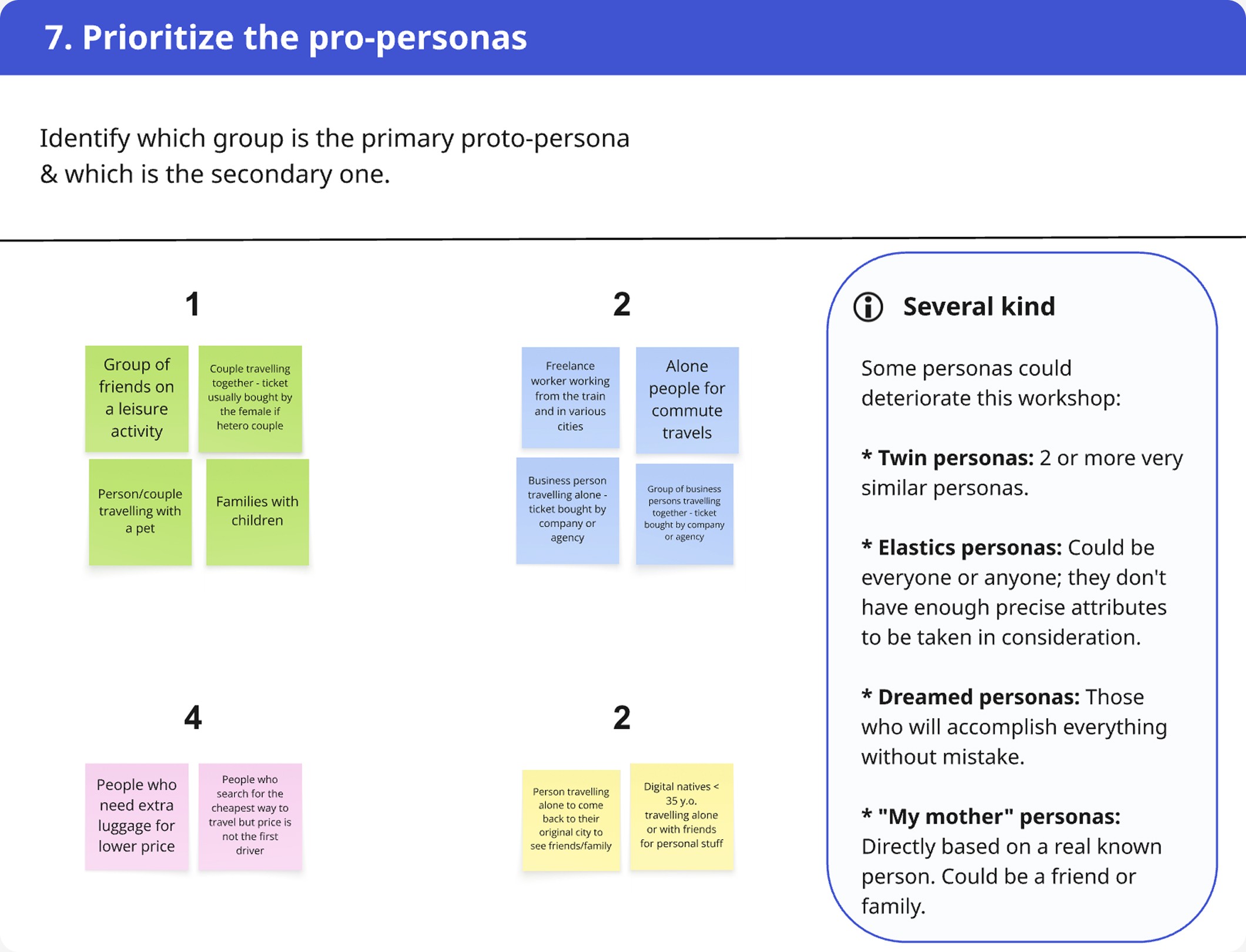
Identify the main use case
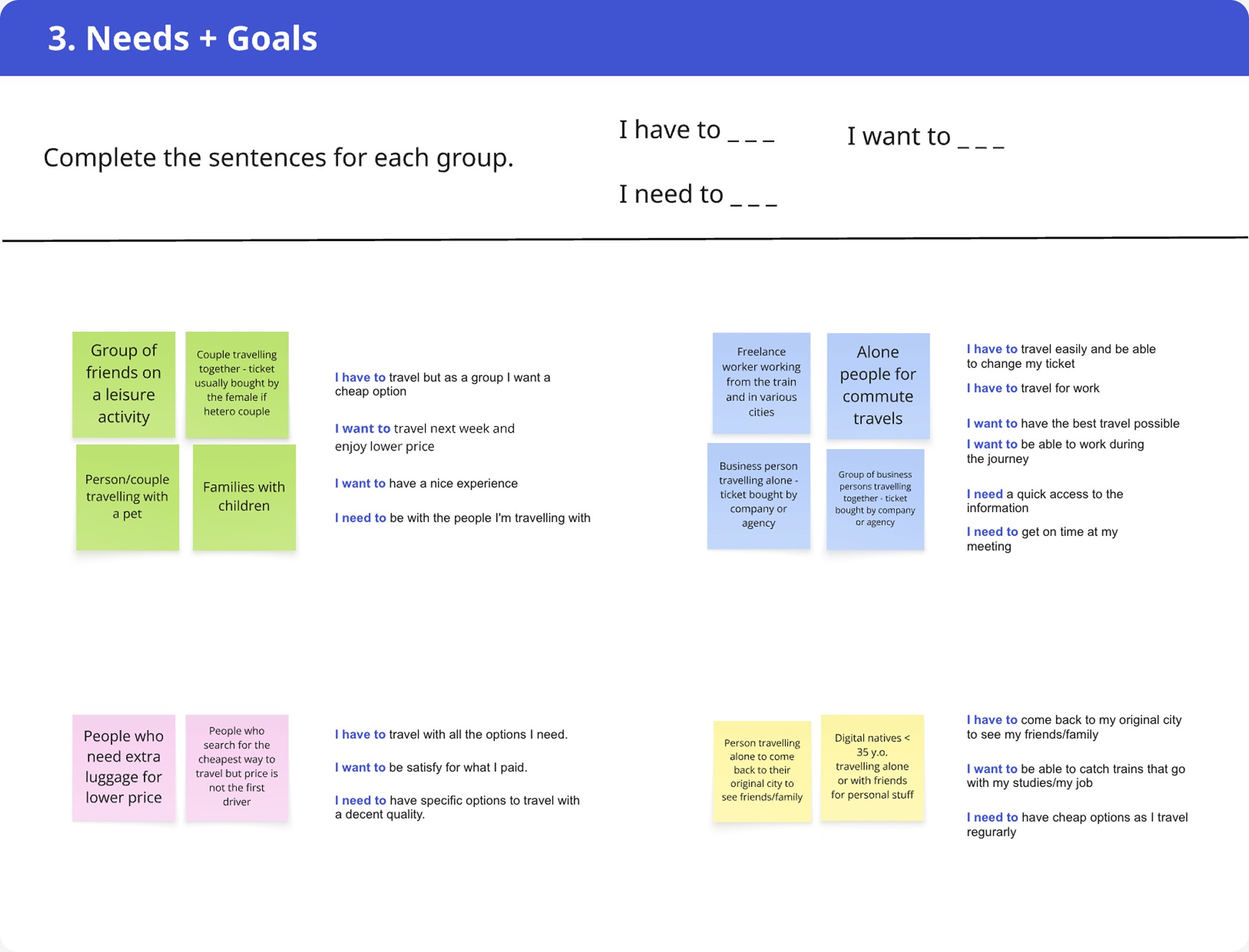
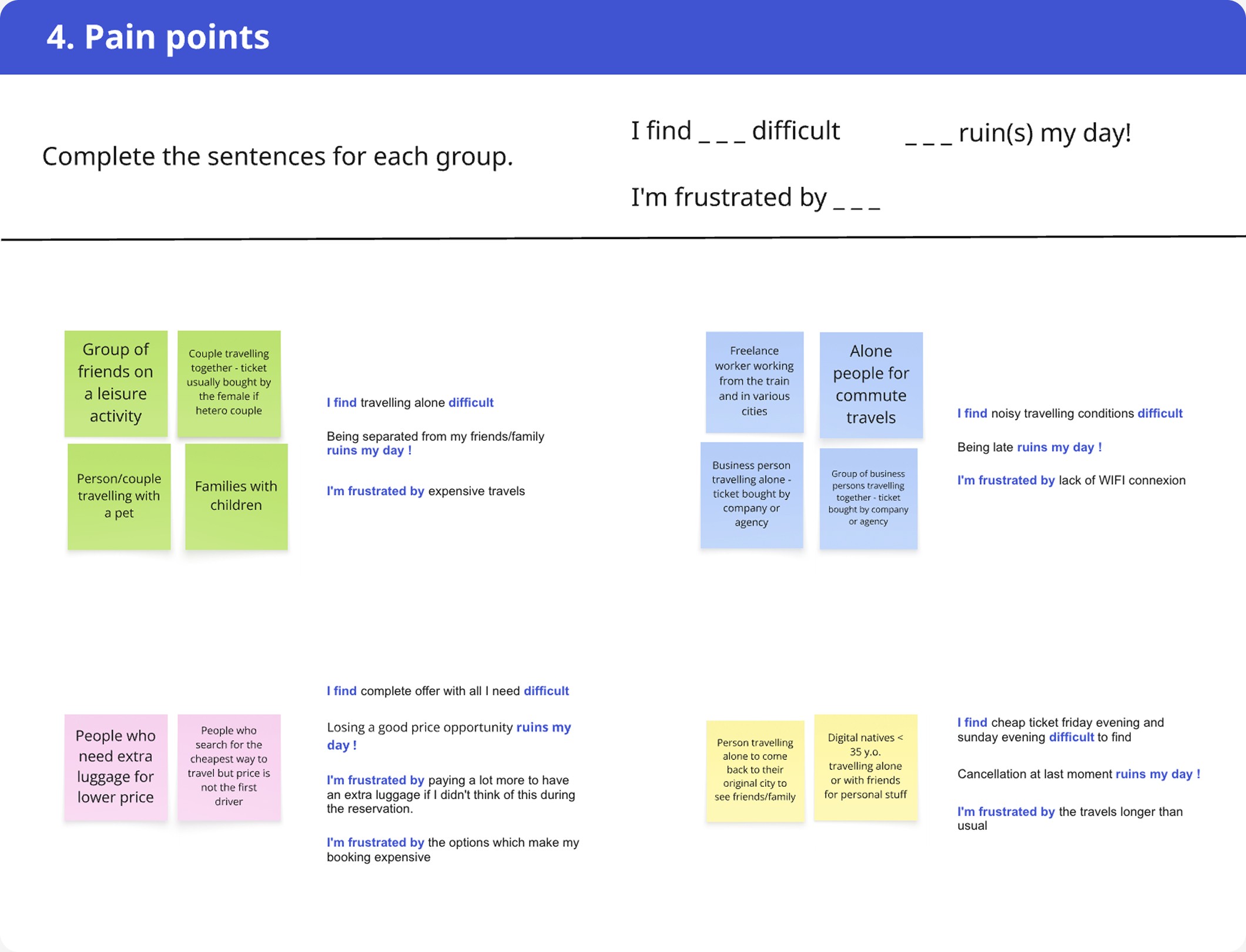
Proto-persona workshop
With a restrained schedule and limited resources, I chose to anchor the workshop around proto-personas instead of qualitative interviews, or observational studies.
It created a shared foundation that the team could build on in subsequent stages of the redesign.
Goal: create a starting point while highlighting patterns, and map potential use cases without delaying the process.

A workshop scaled in 7 steps

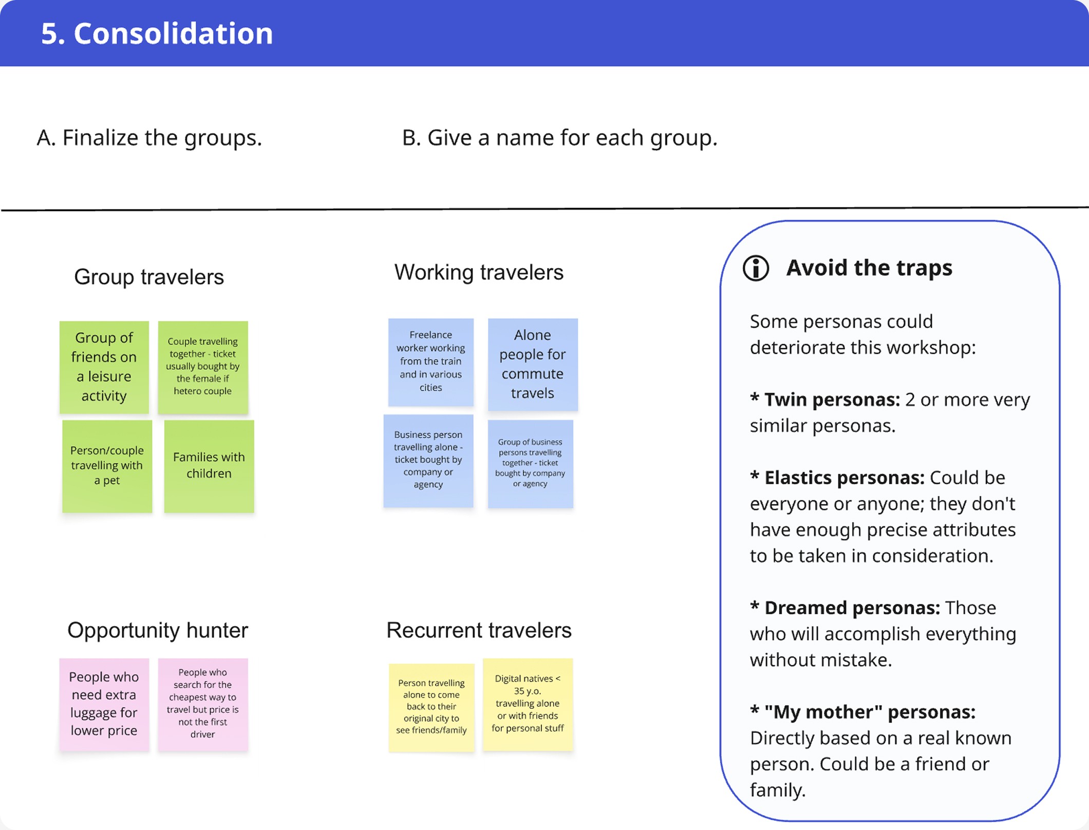
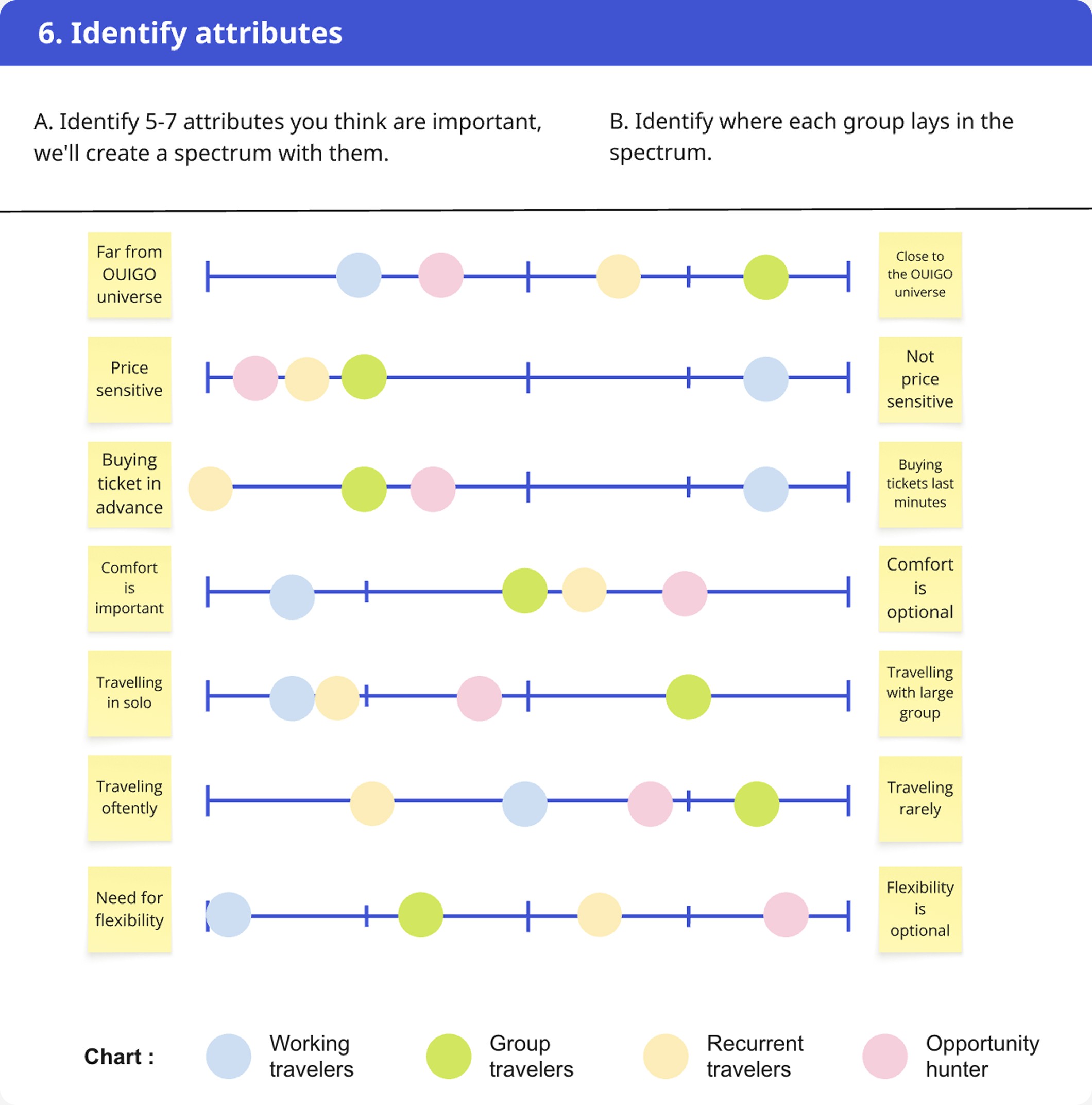
Key outcomes

All of those audiences have got their own interest like the price of the reservations, the comfort provided by the options, and the brand universe.
4 distinct targets audience
Group travelers
Friends and families who enjoy sharing experiences and travel mostly during holidays or week-end sometimes.
Working travelers
Freelance worker and business persons, working during the travel in good conditions.
Opportunity hunter
Customers whom doesn’t pay attention of the brand effort but the price.
Recurrent travelers
Travelers who take the train regularly to go work or return to their family for students case.
Key insight
The attribute’s spectrum offers several layers of reading,
which is vital to take strategic decisions further.
Claim
Imagine a narrative positioning
Launch tweet workshop
This workshop is a simple yet powerful activity where the team had to summarize the new offering in under 280 characters. The brevity forced focus, pushing the group to distill the essence of the redesign into a single, compelling message.
Goal: anchored the team and redact an early marketing pitch that stakeholders could rally around.

A nice look & feel to visualize the result of their effort !
Outcomes
This workshop was a great opportunity to keep in mind the customers top priorities like the price range or the options include.
Final result

Group travelers target

Working travelers target
Unfold
Choose the key moment of the experience
User flow workshop
The user flow approach was better over a user journey one because of its good balance between simplicity and efficiency. While this step can easily expand too broadly, we narrowed it to two key journeys: pre-sales & after-sales.
Based on our proto-personas, I split the stakeholders into 2 teams to map each persona’s ticket-purchase journey. Afterward, both groups reviewed and enriched each other’s work through open discussion.
Goal: target the pages which will be impacted.

The user flow allows a better visualisation of the strategic points to design
Outcomes
This exercise built the workshop’s deliverable: a clear and actionable view of where design interventions were needed.
We decided to design an additional page to include the new offer into the existing flow.
It provides both space efficiency and a clearer overview of what each offer included.
Other impacts were tied to content consistency, such as offers display at payment or post-purchase stages, and to adjustments in push marketing placements.
Steal
Reuse existing solutions
Benchmark workshop
We focused the analysis on how competitors and adjacent sectors, such as telecoms and low-cost airlines, display prices.
Goal: highlight the strengths and weaknesses by different angles to define a clear path for the execution step.
Outcome
Execute
Build a working version
Quick actionable prototypes
Guided by our proto-personas, the design needed to emphasize price clarity for Group Travelers while offering clear visibility of premium options for Working Travelers, who value comfort and productivity on the move.
1rst draft: tabublation & swipe

2nd draft: tabulation
Despite the positives feedback in intern, there was a flaw for the commercials: users who started with the lowest offer couldn’t easily see what higher tiers included.
For that, I expanded the cards and harmonized the layouts across offers.
Pros: highlighted upsell opportunities
Cons: increased cognitive load
This version was to monitor closely through user testing and analytics later to avoid any misstep.

Harmonize the flows
The pre-sales validated, it was the turn of the after-sales flow to be revamped to ensure that the new offers were clearly visible in booking summaries.
Decide
Evaluate the quality of the solution
GO/NO GO meeting
With the work achieved, the company launched in Spain with more serenity.
Budget and time constraints prevented user testing with Spanish customers, meaning this phase served as a confidence check on the work completed.

