
BIOGEN
Neurodiem
The daily news for
neurologists
Neurodiem is a neurology news hub offering a rich library of articles and videos to better support neurologists in their daily practice.
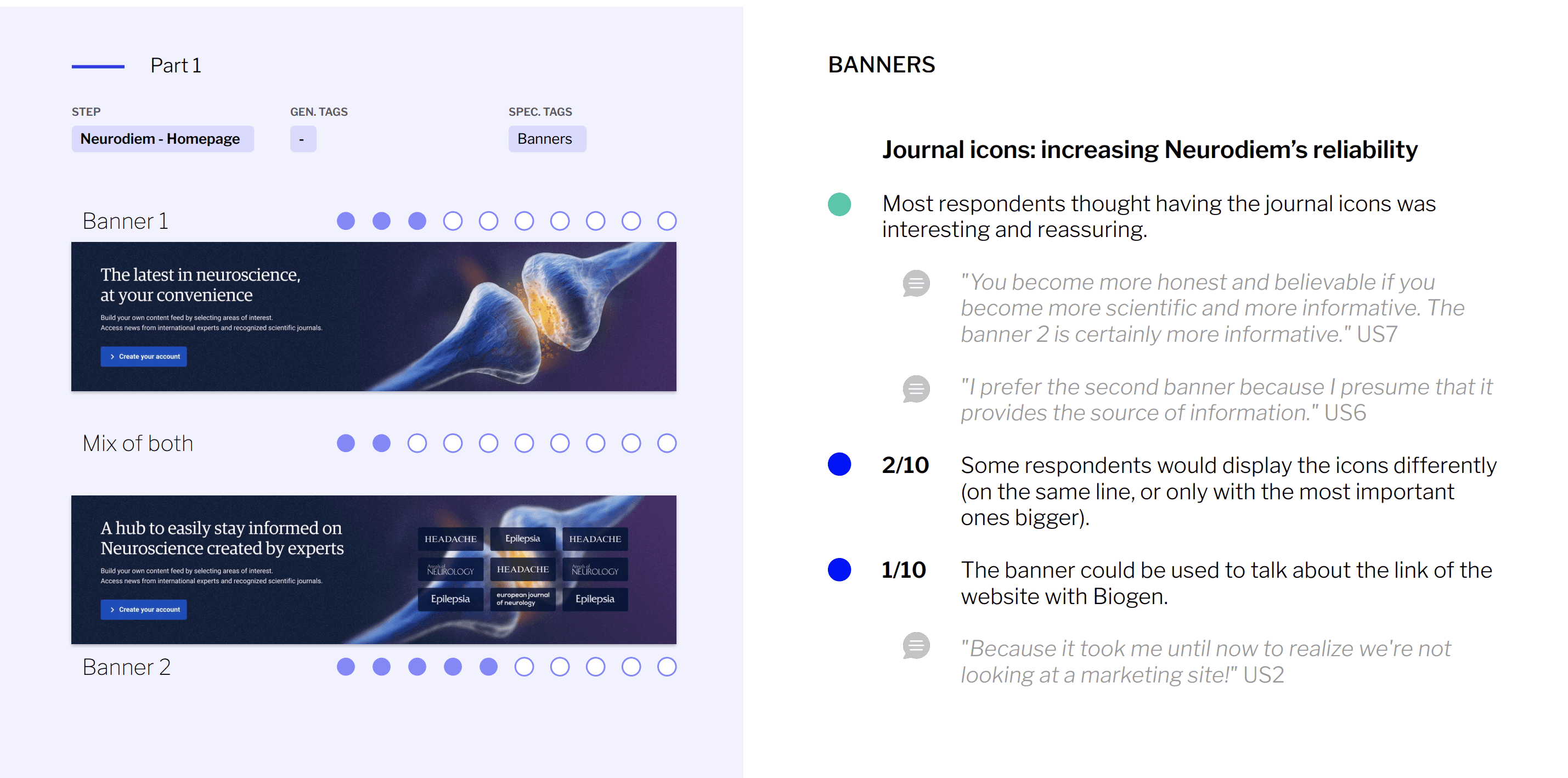
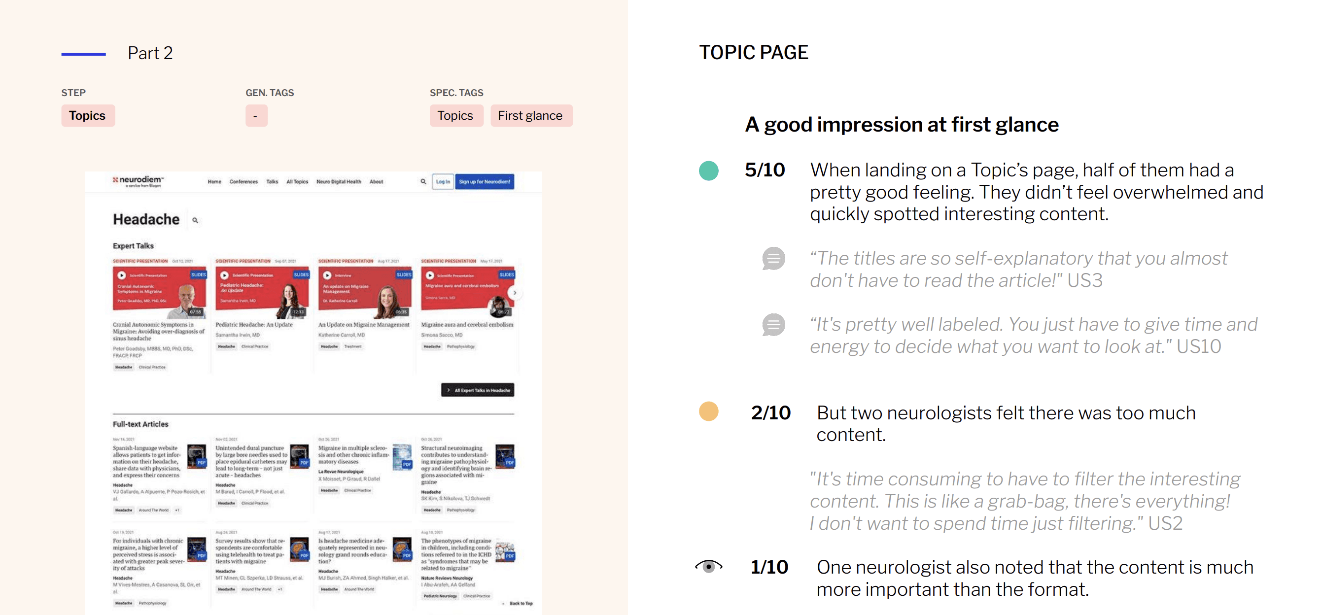
Confusion & skepticism
Neurologists faced confusion around its complex categorization system and were skeptical about Biogen's commercial intentions with the platform.
Let's find out!
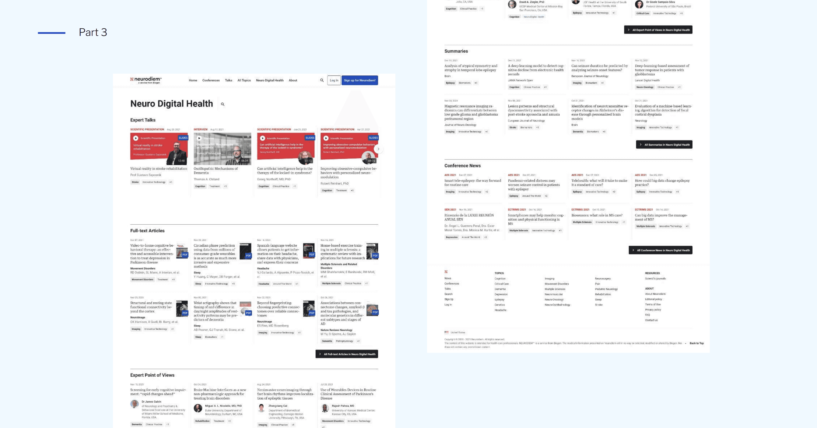
To solve it, I proposed a group of 10 user tests to frame the issues on the homepage and categorized pages.
How to reassure neurologists
about our mission?
Orientation of the study
Objectives
Evaluate the new reassurance contents.
Gather feedback on the new topics sorting.
Type of user test
Qualitative in double-blinded for the patients.
Panel
10 U.S.A neurologists, 100% non-users.
Exhaustive specialisties, 50/50 generalists & specialists.
Material
Neurodiem website & Figma prototype.
The results
After the 10 interviews conducted by Wedo Studios (to respect the double-blind policy), I quickly reviewed the results to have a first impression, then held a feedback session with the agency to predefine the main deliverable axes.
Outcomes of my works on Neurodiem
Continuous improvement
Step by step, we've enhanced Neurodiem with personalization, usability, and trust improvement for neurologists across different markets.
Key Takeaway: User test judging personalization features on the homepage, clarifying categorization relationships, and strengthening reassurance messaging about content independence.
Country adaptation
Reveal the need for more structured, context-rich experiences, influencing future localization strategies beyond simple translation during my tests with Japanese neurologists.
Key Takeaway: Usability test with 10 Japanese neurologists. Highlight the insight that patterns can differ from a country to another. Beyond simple translation, a website should match the behaviors of different ethnic groups.
Improve the notifications
Optimize our mobile app notifications by findings neurologists caught up news during lunch breaks and valued concise, audible formats.
Based on this, I proposed adding audible executive summaries to each article and timed podcast pushes to match their availability.
Key Takeaway: Exploratory survey on User Zoom with 50 neurologists across Europe to explore daily routine to stay up-to-date, and perception of notifications.
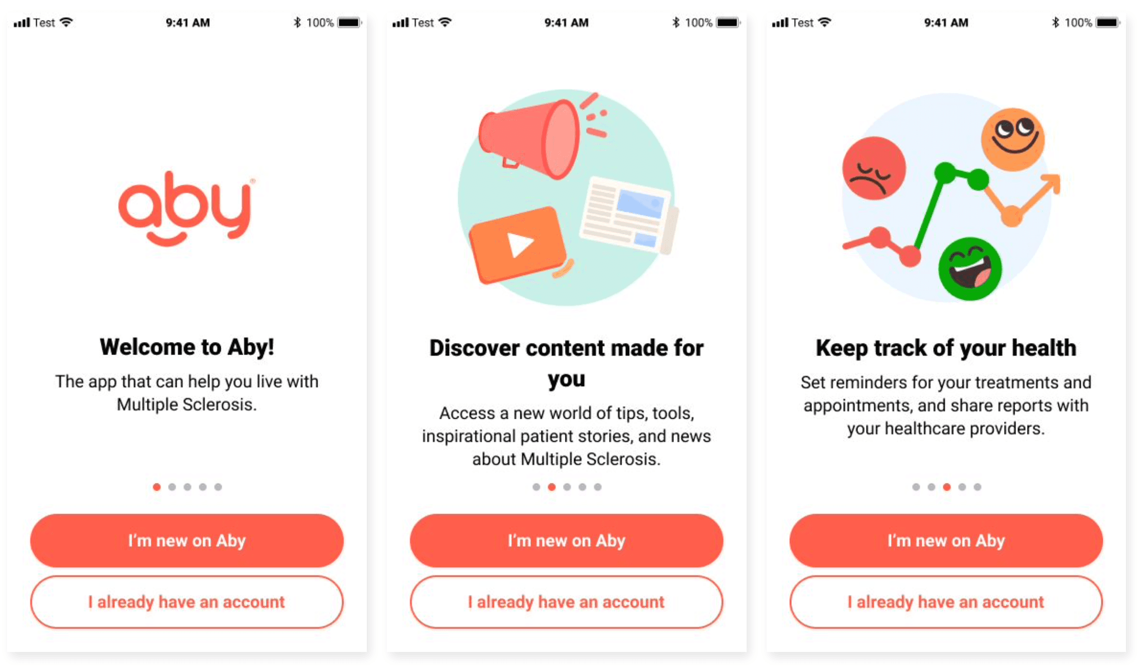
Cleo

A genuine health comapnion
Cleo helps patients to manage daily life beyond the multiple sclerosis (MS) disease with practical daily support while complying with strict medical frameworks.
Ease a critical flow
Despite our intention to ease their life, 50% of patents didn't finish the sign-up flow because of cognitive fatigue.
Emotional design
Creating a peaceful dynamic continuous background that evolved with each completed step was our best try to improve the brand's perception while helping patients during this process.
How to optimize our sign up flow to make it less overwhelming?
Preparation of the study
Objectives
Testing the 2 flows. Half of the panel start with the first flow, the other half with the 2nd to ensure balanced insights.
Type of user test
Qualitative, in double-blinded.
Panel
10 MS patients of varying severity, 100% non-users.
Material & activities
Figma prototype,
Think aloud, card sorting & UX Scale

Key thought
Is progressive design would be the answer?
A salvator postponed
Due to Thanksgiving period our tests were postponed, giving us time to strengthen the weakest flow.
Meanwhile, we were exploring emotional design with my user research colleague Melina Angelo to resolve feedback that our healthcare apps felt “too white”.
It’s in this context that I suggested a dynamic continuous background that evolved with each completed step; an idea adopted to enhance brand perception and user engagement.

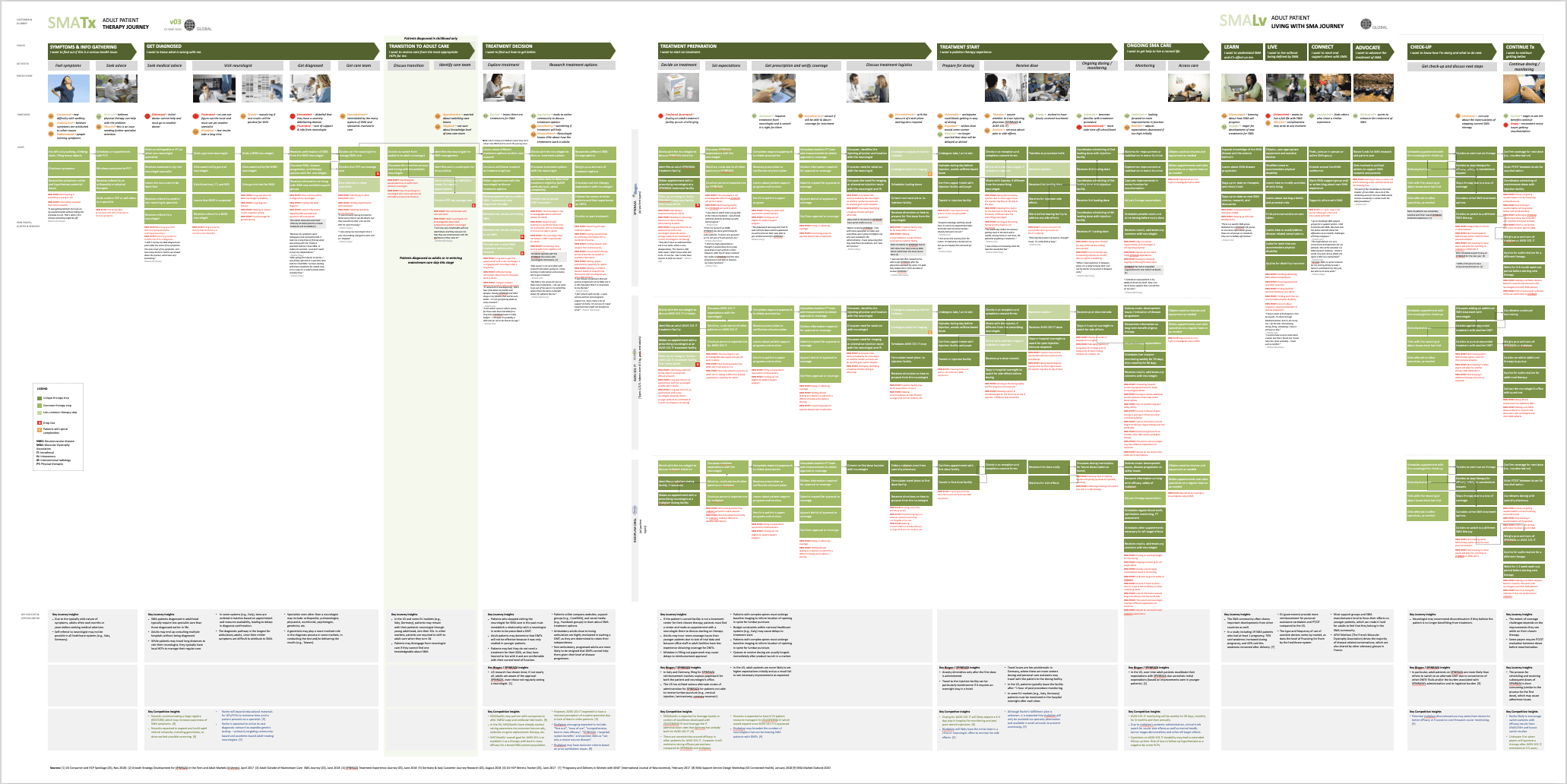
PhysioMe
How to help SMA patients
The Spinal Muscular Atrophy (SMA) is a rare genetic disorder causing progressive muscle weakness. I had the opportunity to work on the genesis of this project.
A full process
To support them, I synthesized association surveys, YouTube observations, and diary studies to know more about their daily life.
An answer adapted for them
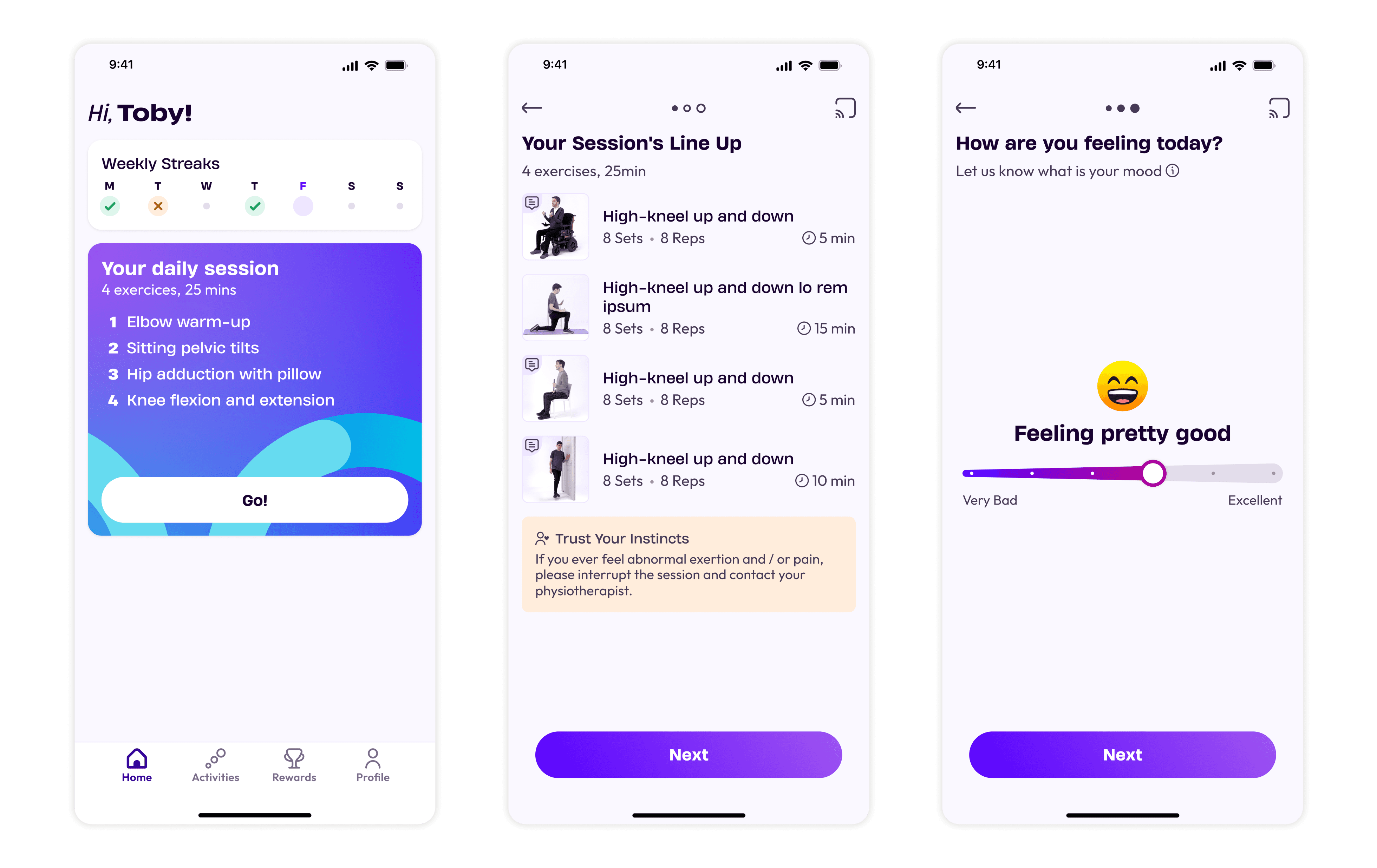
We create a digital solution allowing patients to exercise, with the help of their physiotherapists. It was an accessible app broadcastable on TVs for wheelchair users.
How to help people suffering of SMA?
Learn more about the patients life
My lead designer had already gathered valuable insights, including a user journey mapping the path from early symptoms to therapy setup.
In addition, I immersed myself in the daily realities of SMA patients by watching countless videos. Those testimonies revealed the daily challenges of living with SMA and the importance of maintaining muscle strength.
These insights acted as a shortcut to empathy, providing valuable context long before direct patient research.
A giant step thanks to the associations
We also partnered with CureSMA, the largest U.S. SMA association, which shared a survey report filled with raw data.
I cleaned it and synthesized to deliver actionable insights at the direction.
After aligning through focus groups, we launched our own first survey to explore exercise habits and digital behaviors, both crucial for shaping the product experience.
«I cleaned the kitchen and did 3 loads of laundry. That is physical activity for someone in a wheelchair.»
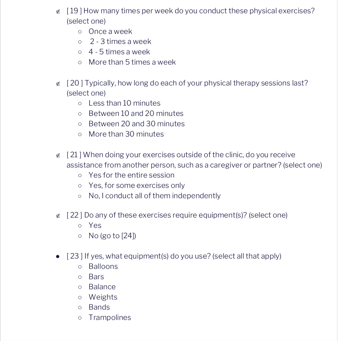
Diary study
To go further in our research, we launched diary studies in collaboration with CureSMA to capture temporal insights in real-life contexts.
The primary objective was to collect detailed data on strength training sessions over a one-month period.
Participants completed entries after each session, noting day and time, with a hybrid diary format: structured closed questions for consistency, complemented by open fields for richer qualitative input.
My mission finished before being able to study the results.

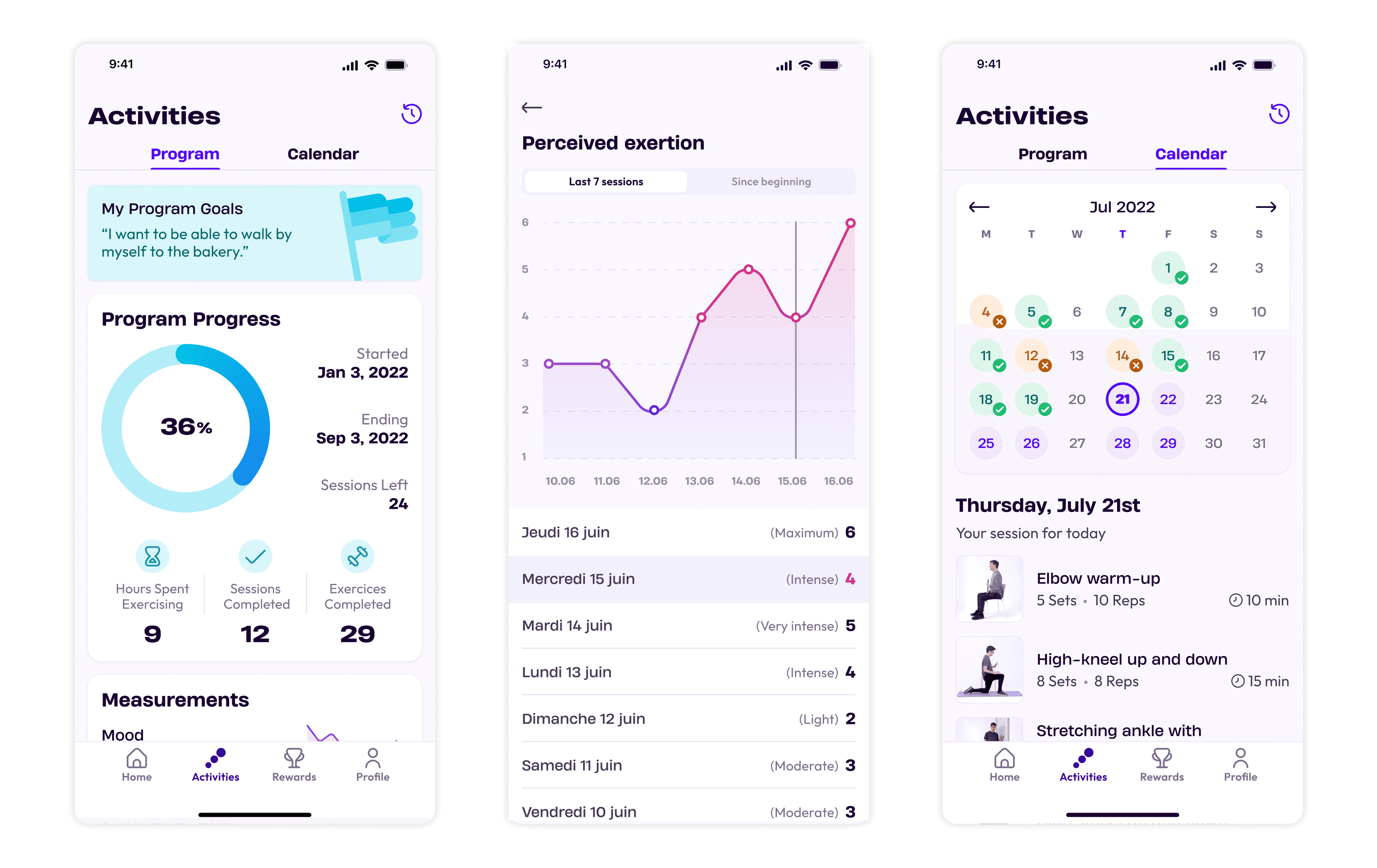
Illustrative image (the actual is under confidentiality).
Result of this research process
Based on our detailed work, we launched an app proposing exercise sessions designed by physiotherapists, TV-broadcastable that accommodated wheelchair users' living room setups.

What did I learn
Impacts on patient’s life
Designing patients is about solving genuine human challenges.
At Biogen, I learned that when design prioritizes patient needs, empathy, and usability, the impact goes beyond numbers.
It improves daily life, builds trust, and creates meaningful experiences that truly matter. I really loved this aspect which gave more sense at my work.
How manage international dimension
Managing the user research of three international products across 17+ countries required advanced planning and strategic prioritization to balance requests and workloads.
I was really happy to work with Wedo Studio to manage the double-blinded policy by conducting the interviews, and for their qualitative deliverables.
Sky is the limit ⭐️
Biogen was my first major experience as a user researcher, and it profoundly shaped my approach. I had the chance to explore atomic research with the intervention of Daniel Pidcock and apply it hands-on.
Special thanks to Melina Angelo, whose guidance and insights on research methods continue to influence my work today.

